The $1,000 Book Cover Contest Results!
The book cover contest began with these the original 80 submissions.
After getting substantial input, I picked the top 10% of the submissions to come up with.....
The Final 8
Tip: Mouse over the cover to enlarge it.
After taking into account the 1,000+ votes, I selected the 4 on the top row. The 4 on the bottom row were eliminated. That brought us to....
The Final 4
As you can see below, two of the covers changed radically. The contest rules let designers modify their designs as much as they wanted.
The two covers on the left advanced to the finals. The two on the right did not get enough votes. Voting results were:
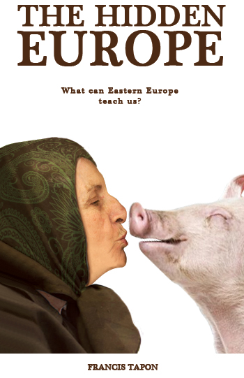
- Finalist 1 - Goat - 22.9%
- Finalist 2 - 6 people - 45%
- Finalist 3 - Grandma - 11.5%
- Finalist 4 - Woman kissing - 20.6%
The Final
Yasmin Rahmani again ditched her design completely (the 6-people) and came up with the "Hiker" cover instead. So the fight was between:
By July 10, 2011, the final vote was:
Hiker 58% vs. Goat 42%
I agreed with the votes and so the winner of the $1,000 Book Cover Contest is Yasmin Rahmani!
Why Yasmin won: Yasmin was a clever designer throughout the contest. She knew I could overrule the voting (I reserved this right so that nobody would have an unfair advantage by having an army of friends to stuff the ballot box). She scraped her designs when she realized that she wasn't nailing the concept. She worked hard to understand what the book was about and who was the target audience. Throughout the contest she would send me cover concepts and bounce off ideas. With each iteration, she got closer and closer to perfection.
The revised winning design
Yasmin tweaked her Hiker concept and produced this, the final cover:
Visit Yasmin Rahmani's website to learn more about her and/or follow her on Twitter.
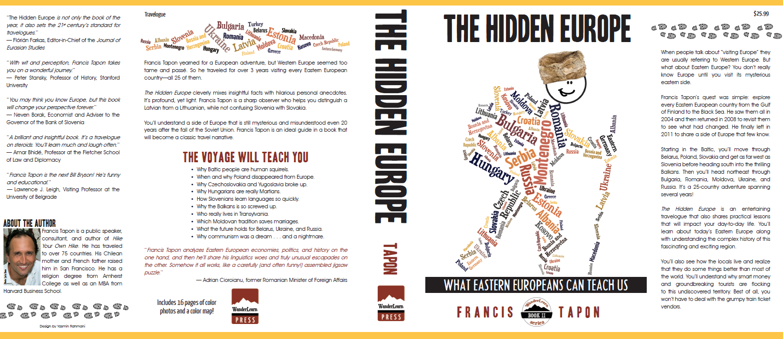
Dust Jacket
As the winner, Yasmin produced the final dust jacket below.
What I learned about book cover designs: A book cover is a work of art. As a result, it suffers from the same problems that all art (paintings, literature, movies) suffer from: it's really hard to please everyone. I would show designs to 10 people and get 10 different answers. Although voting helps get some clarity, it doesn't show the passion behind the votes. There are people who were passionately for the Goat cover and those who were passionately against it. Even professional designers don't agree on everything. Therefore, at some point you just have to say, "I'm happy with it and to hell with the world if they don't like it."
In case you're curious about the book itself to see if the cover matches the book, then read....
What the book is about: It’s a non-fiction travel narrative about the author’s 3-years of travel all over Eastern Europe. The book discusses each country, including its culture, history, food, habits, language, etc. The book pokes fun of many things and is often lighthearted. It is NOT a serious guidebook nor a history book. Most people will find parts of it funny, but also educational and profound. If you want to learn more, visit The Hidden Europe’s page.
Who is the target audience: Educated travelers, who are curious about Eastern Europe or who enjoy reading travelogues. People who are tied to Europe in some way (especially Eastern Europe) will be most interested.


