Below are the 80 submissions for the $1,000 Book Cover Contest. We are not accepting any more entries. Included in the list are the Top 8 Finalists, as a well as the Honorable Mentions.
The Top 8 Finalists will compete for the $1,000 Prize in three competitive rounds. Each round will eliminate half the competitors.
Best Designer Overall: Yasmin Rahmani. She combined humor with beautiful design. She's the only designer (so far) who has two covers in the finals.
Most Creative Designer: Scott Neilson. He really thinks out-of-the-box.
I gave an Honorable Mention to a cover that I seriously considered to make the Final 8. First, a few FAQ:
Why didn't my cover make the final 8?
- Most covers that did not win lacked humor. Some of them were quite pretty, super creative, and well done, but they didn't make you smile or laugh. Although humor wasn't a required element, I did suggest and encourage it because the book is not super serious.
- Other covers had humor, but they reflected a lower design quality than some of the other covers.
- Some covers felt too communist, which will offend Eastern Europeans who dislike being stereotyped as former-communists.
- Several looked like great covers for a guidebook, but my book isn’t a guidebook.
But some of the final 8 covers aren't that humorous. Why did they get picked?
They had other design qualities. With some tweaking and a sprinkling of humor, the final 8 covers could be quite good.
Of course, book covers are art. Thus, like all art, it’s incredibly subjective. I asked random friends to tell me which were their favorite ones and a few of their top picks were the designs I liked the least! This made it clear to me that there’s no right answer and that whichever cover ends up winning will get lots of people saying, “You picked that shitty cover as the best one?!?!” You can’t please everyone.
Which covers did well?
The covers that worked best were the ones that have a bit of a paradox—a juxtaposition of two contradicting items. For example, a babushka who is normally sad and depressing, but in this photo, she's got the springtime behind her and a jolly clever look to her face. Or a goat where you don't expect a goat to be – in the middle of a beautiful, sophisticated Eastern European setting. It’s blending the old and new, the communist with the capitalist, the rustic with the sophisticated, the elegant and the crass. To win this contest, the covers that have that will have a good chance.
Many submissions played with the hidden concept. Some ideas were quite clever. However, they often lack the fun, humorous element, or that contradicting / paradoxical concept that I mention above. The book does uncover hidden things, but does it in an irreverent way. The cover should capture that.
So which covers made the final 8?
No design is head-and-shoulders above the rest. I’ve ranked them so that "Finalist #3" is ranked #3 for now. Don't put too much meaning into this. Still, those near the bottom of the 8 will need to tweak their designs more radically than those near the top in order to stay in the competition. If you are a Finalist, please read the yellow highlighted section on the Contest Rules page.
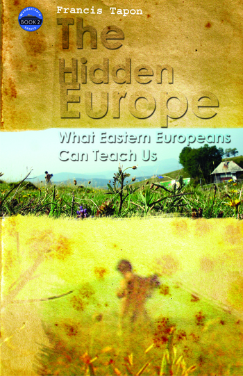
Maiu Reismann from Tallinn, Estonia - 3 submissions

FINALIST #3
Pros: The grandmother makes you smile. Unlike the stereotypical Eastern European babuska, she's happy and seems like she's about to say, “OK, let me tell you how it is...” She about to lecture you about what Eastern Europeans can teach you in a no-nonsense way.
Cons: The layout and fonts is a bit bland.


Angel Cana from Timisoara, Romania - 2 submissions

Scott Neilson Freelance Graphic Designer and Illustrator from UK - 6 submissions

HONORABLE MENTION

HONORABLE MENTION

FINALIST #8!
PROS: Creative and yellow jacket is positive. Makes some people smile.
CONS: The hat is not Eastern European enough - it's almost Russian, but not really. Needs more of a giggle-factor and a stronger Eastern European flavor.


HONORABLE MENTION

HONORABLE MENTION


FINALIST #5!
Pros: I like the idea of an illustration. All of Steve's ideas get a 10/10 for creativity. I really love all his ingenious covers – they are great, clever concepts. Their only shortcoming is that they don't match the writing style of the book. It was hard to pick, but I picked the one with the most humor.
Cons: The woman would have to be a beautiful Eastern European woman to make it more funny and paradoxical. Somehow it would have to be clear that the woman is Eastern European and maybe even that pig is Eastern European.
Vladimir Kerchelaev from Vladikavkaz, the North Ossetia - 11 submissions


HONORABLE MENTION: A bookstore owner told me this was the best one.

Annie Krupa from Poland - 2 submissions


Jessie Kroeger - graphic design major at Missouri State University - 2 submissions


Octavian from Romania - 9 submissions


HONORABLE MENTION

HONORABLE MENTION

HONORABLE MENTION

FINALIST #4!
Pros: All your designs are excellent, but this one has the most fun-factor in it. The font and color scheme is perfect because they signal to the reader that this won't be a boring, serious book. Well done.
Cons: The pig has the giggle-factor, but it's just not Eastern European enough. I know the pig statue is from Prague, but nobody will know that or associate it with Eastern Europe. So try a different image that might make people think of Eastern Europe, without being super communist or even Russian. Russia is just one of the 25 chapters, so I want something more generic.

HONORABLE MENTION

HONORABLE MENTION: The last minute cupid ideas is also fun, but it might make some people think it's a book about love affairs in Eastern Europe. And while love plays a role, it might be too much to put it in the cover like that. Also the Soviet symbol may get some backlash. Still, I like them.

This email address is being protected from spambots. You need JavaScript enabled to view it. - Russian doing graphic design in China - 1 submission

HONORABLE MENTION: I am awaiting a minor modification on this design.
Yasmin Rahmani - USA - 3 submissions

HONORABLE MENTION

FINALIST #2
Pros: Clean, beautiful layout. Great fonts. Nice hint of Eastern Europe with the hat.
Cons: It's not clear what the eggs represent. Perhaps they are ambiguous on purpose to let people attach whatever meaning they want. I like it, but I just know everyone will ask me what’s the eggs represent. I’m not sure if you should change that though, but I’m curious to see how people like it. One problem: all 3 images are related to Russians. It would be better to have one that's more Balkan and the other that's more Baltic or Polish/Hungarian/Czech. Minor point: correct the subtitle – it’s not a question.

HONORABLE MENTION

HONORABLE MENTION: I like the diverse symbols. It's a slick, cool cover. It lacks humor. Feels a bit cold - lacks the emotion of your other covers.

FINALIST #6!
Pros: Yet another clean, attractive design from Yasmin. Has humor. Simple.
Cons: Needs to say Book II of the WanderLearn Series because others they may look for Book I of "The Hidden Europe." It's strongly Russian. May mix in some other symbols.
James L from the USA - 20 submissions


HONORABLE MENTION

HONORABLE MENTION


Adrian Jugaru- Romania - 1 submission


David Gómez-Rosado - San Francisco designer - 4 submissions

HONORABLE MENTION

HONORABLE MENTION


FINALIST #7!
Pros: Slick cover. Adding the spray painted smile at the end turned the heavy, somber, and intense mood into something better.
Cons: The spray paint can worked as a quick fix to meet the contest deadline, but it may need some more tweaking. Maybe play with the colors. I'm not sure. You're better at this than me.
Annalynn Smith - This email address is being protected from spambots. You need JavaScript enabled to view it. - 1 submission

FINALIST #1!
Pros: Hilarious. Silly. It’s the only submission cover that made me burst out laughing. It's preposterous. Brilliant matching of the beauty and sophisticated side of Eastern Europe (the photo of Croatia's Dubrovnik) with the quirky, rustic, backwards, not-so-polished side of Eastern Europe (the photo of the Bulgarian goat).
Cons: The left and right edges need photoshopping. Needs better fonts. Since the photo combo is so silly, I suspect a serious font would be best (instead of a whimsical, fun font). It needs a more professional, polished look. All the other Finalists have a better font selection, layout, and design. Look at Yasmin's font selection and design for some ideas - she's the master. Still, feel good that you're the most promising design so far. Don't blow your lead.
Sonja Heinen - 2 submissions


Tessa Ogden - Oklahoma - 2 submissions


HONORABLE MENTION
Ivan Milosevic - Belgrade, Serbia - 1 submission

Courtney - Oklahoma - 1 submission